 Last
Updated: 05/20/2020
Last
Updated: 05/20/2020
 ( 12 minutes reading )
A page without content is like a building without a foundation - it will simply not hold anyone! This is why it is important to populate your pages with fantastic content, which will draw the attention of visitors and help you either start a great business or build a robust community. In this tutorial, we are going to teach you how to add content to your page in TYPO3. Let’s begin!
To start adding content to your pages in TYPO3, you need to log into your Admin Dashboard first. To do that, please add “/typo3” to your domain name - for example, “mycms.com/typo3” where “mycms.com” is your actual domain.

Accessing the mentioned URL will show a login page, where you have to enter your login credentials to access the backend. We also highly recommend checking our Typo3 Backend Overview tutorial, which will teach you the basics.
Once you have logged inside your dashboard, please point your attention to the left, where you will see the Module Menu.

Right under the “Web” section, you will see the “Page” option. When you click on it, the page will be refreshed, and the so-called Page Tree will appear in the middle of the screen. It will contain a list of all your pages.
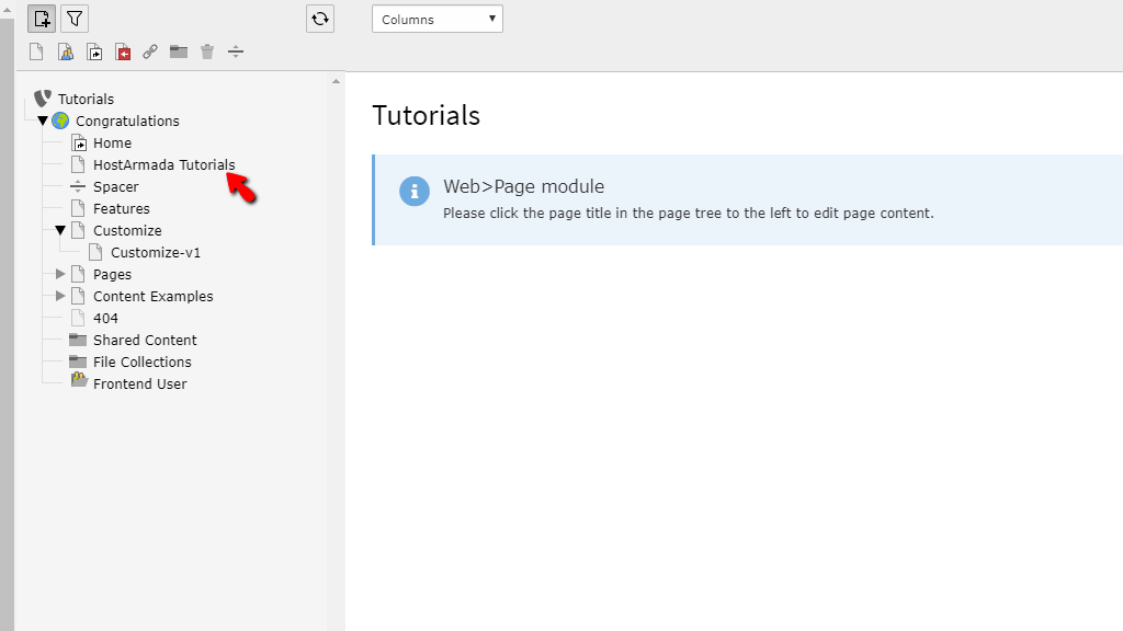
Left-clicking on a page from the list will refresh the middle section of the screen once more, and it will display options for you to add content to it.

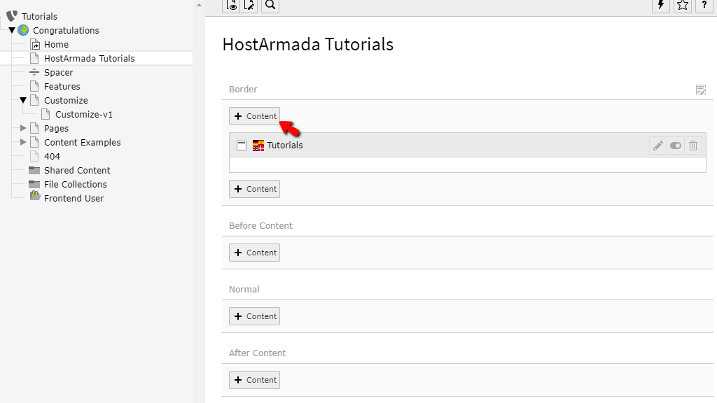
Now, the areas in which you add content are entirely reliant on your theme. Considering that, what you see on your side could be completely different in regards to the layout of the page. Although the principles of adding content will be completely analogical.
To add a content element to the page, all you need to do is press the “+ Content” button corresponding to the area on the page where you want to insert it. For example - the “+ Content” button within the first block will add the content element(s) right on top of the page, below the navigation menus.
Once you have clicked on the intended "+ Content" button, a popup window, containing all content types you can add will be presented. The options are quite a lot, and we cannot cover all of them, however, we will try and mention the ones you will use most often.
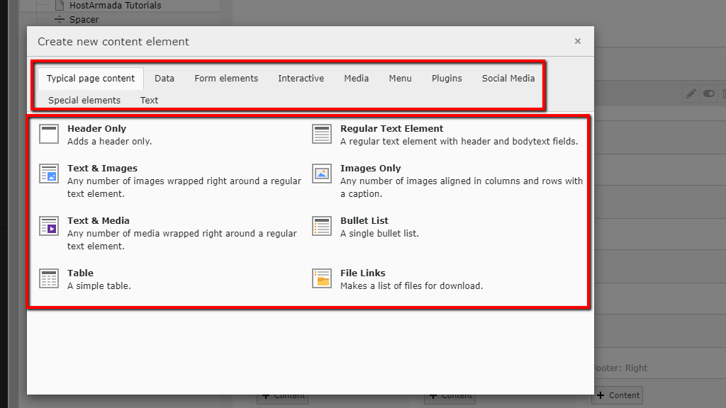
Under the “Typical page content” tab, you will see the most commonly used content elements. We will list some of them and some of the elements that are located under the other tabs underneath.
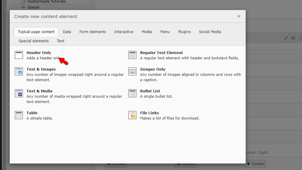
For the purposes of this tutorial, we will go through the processes of adding a Header Only element, as it is perfect for beginners. The rest of the elements will be somewhat similar, with a few exceptions.
Please select the “Header Only” option to open up the element customization screen.
The element customization screen will be divided into separate tabes, each containing specific aspects you can change for the element, such as the text, its position, its type, alignment, and some other custom things which will be related to the current theme you are using.

These alteration options will be grouped under a few tabs.
Each setting under the “General” tab will allow you to change specific details. The most important of which is the actual name of the newly created header element. Let’s go over all the options you have under this tab, in the same manner, they are actually listed. You will see two sections.
Under the “Content Element“ section, you will find Two options represented by dropdown menus.

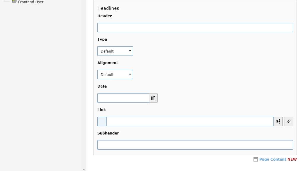
Going down, you will reach the “Headlines” section. This section has a few options, which we will explain underneath:
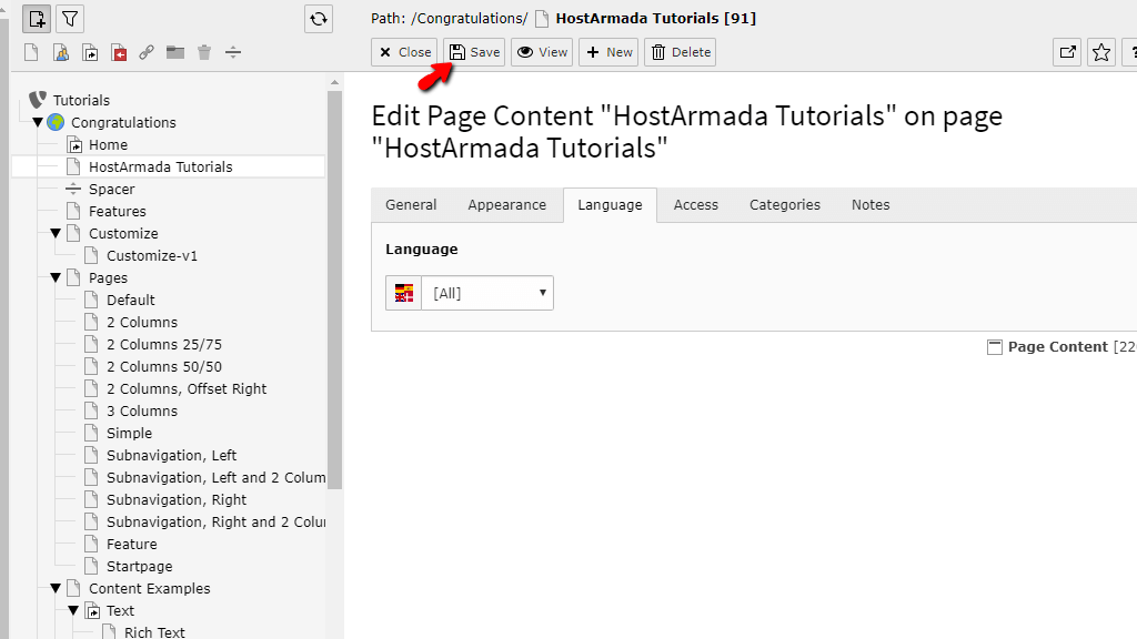
If you are happy with the settings you made under this tab, please click the “Save” button located on the top of the screen.

To view your changes, you can press the “View” button, which will be located right next to the “Save” button.

This process will put the content element on the page, using the defined settings you made.
The appearance tab will contain all sorts of options you can use to change the visual look of your element. Let’s go over all the options you have under this tab in the same order they are listed. You will see two sections.
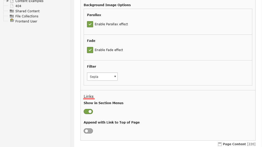
The first one is the “Content Element Layout”. Here is everything that you can do underneath.

The second section is the link section, which only has two options underneath it.
If you are happy with the settings you made under this tab, please click the “Save” button located on the top of the screen.

To view your changes, you can press the “View” button, which will be located right next to the “Save” button.
The languages tab will allow you to select a language for the specific element.

If you are happy with the settings you made under this tab, please click the “Save” button located on the top of the screen.
To view your changes, you can press the “View” button, which will be located right next to the “Save” button.
This will only be available if the theme actually has language choices attached to it. Otherwise, the default “English” will be used.
The "Access" tab will allow you to control the visibility of the element to the people visiting the site. You will see four options there.

If you are happy with the settings you made under this tab, please click the “Save” button located on the top of the screen.

The categories tab will allow you to group and put the element under a specific category. Categories are typically created using coding, and if you are interested in how to do it, you should check the official documentation. In our case, these examples are generated by the theme we have installed.

If you are happy with the settings you made under this tab, please click the “Save” button located on the top of the screen.

The last tab provides you with a content box, which you can use to put a note for the specific element. This is useful if, for instance, you are still working on it, and you want to let other admins know about your progress.

If you are happy with the note you left under this tab, please click the “Save” button located on the top of the screen.
And there you have it! The way to add content to your pages in the TYPO3 CMS. You may be overwhelmed at first, but if you get used to the method of adding content, you will soon come to realize how flexible, easy, and convenient it is!

Sebahat is a young and bright woman who has become an invaluable part of our team. She started as a Customer Care Representative, mastering that role and, along the way, growing into a tech-savvy individual who is well acquainted with every support layer of the company. Driven by her aim to improve our customers’ experience constantly, she is committed to enhancing the extraordinary support we deliver.
Learn more about TYPO3 in the other tutorials that we have:
